










Butter yellow and denim. Red and pink. Green and yellow. A little bolder than your usual? Good — because these are the summer color combinations that make getting dressed actually fun again, and every one of them is easier to wear than you’d think.
Here’s the part nobody tells you, Grit & Glammers: it isn’t that you’re bad with color. It’s that no one ever taught us how to combine it — so the few times we tried, it felt like too much, and we backed right off. The good news? This is a skill, not a talent, and it comes down to a handful of simple rules. Today I’m teaching you one rule at a time and showing you exactly what it looks like on a real outfit — seven times over, each with a clear verdict. If neutrals are more your comfort zone, start with my guide to adding a pop of color to your outfit and work your way up to these.
Key Takeaways
- The foundation rule: let one color lead and a neutral ground it — denim is summer’s secret neutral.
- Colors don’t need to match; they need to relate. Red and pink work because pink is red with the volume turned down.
- Low contrast reads rich. Brown and ivory is the easiest “expensive” combination of the season.
- When the palette is classic — think blue and white — you’ve earned bold texture and pattern.
- Every look below is linked so you can shop it directly.

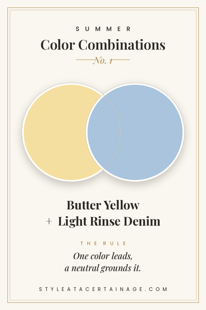
1. Butter Yellow + Light Rinse Denim
The rule: one color leads, a neutral grounds it. Start here, because this is the rule everything else is built on.
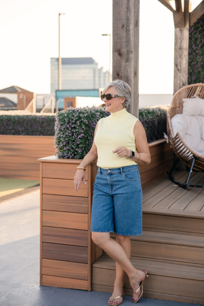
Denim is the great secret neutral of summer — it grounds almost anything. Picture a butter-yellow sleeveless turtleneck with light-rinse denim — or denim Bermuda shorts if the day calls for it — gold kitten heels, and gold hoops. Prefer one-and-done? The yellow T-shirt dress, white sneakers, and a light-rinse denim shirt draped over your shoulders give you the same look with zero effort.
Why it works: butter yellow and faded blue sit on opposite sides of the color wheel, so there’s a natural freshness between them — but because both are soft, washed-out versions, you get the lift of a contrast with none of the clash.
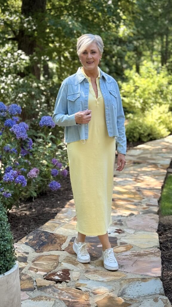
VERDICT: Buy. The most flattering, lowest-risk color moment you’ll make all summer.
Shop the look
- Similar Turtleneck
- Denim Bermuda Shorts
- Straight Leg Denim
- Gold Thong Kitten Heels
- Yellow T-Shirt Dress
- Light Rinse Denim Shirt
- White Leather Sneakers
That one was easy. Here’s the rule we’ve all been taught wrong.
2. Red + Pink
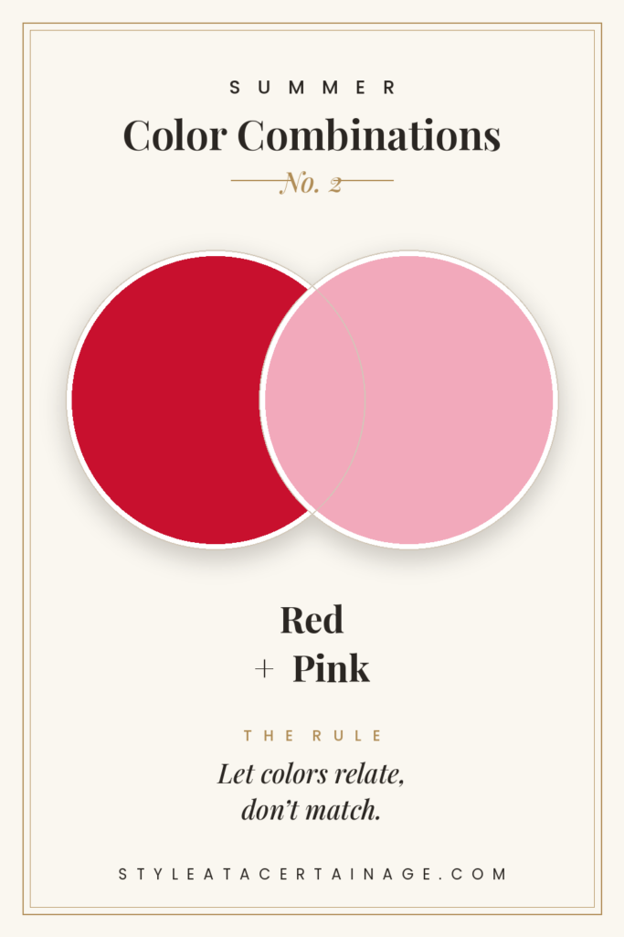
The rule: let colors relate, don’t match.
We were all told red and pink “clash.” They don’t.
Colors that live near each other don’t need to match — they just need to relate. Picture red jeans — the Frances Valentine pair — with a white crochet tank trimmed in orange and pink, and charm sandals to ground it.
Why it works: pink is really just red with the volume turned down, and orange is its warm next-door neighbor — so the trim reads as one family with the jeans, and your eye connects them instantly. The crochet trim is the little bridge; the white tank and neutral sandal keep the whole thing sophisticated instead of loud.
VERDICT: Buy — the crochet trim is the detail that keeps a red this bold from shouting. Skip if your red leans orange; you want a clear, true red so the trim can do the relating.
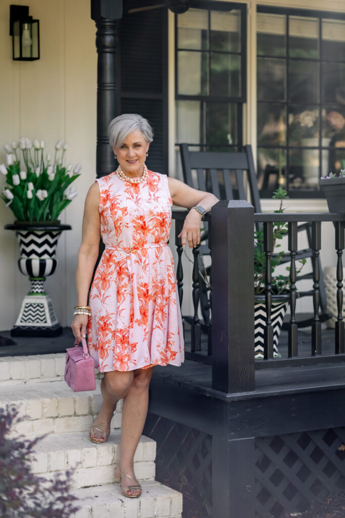
Want the rule in one piece? A pink dress covered in orange blooms proves the same point — orange and pink are relatives, too, and a pink bag leans into the family instead of fighting it.
Shop the look
Next: what to do when you want two bold colors at once.
3. Green + Yellow
The rule: two bold colors can lead, if everything else goes quiet.
You don’t always have to pick one color — but if you want two, everything else gets out of the way.
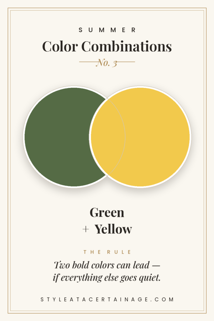
Picture green chinos with a yellow ribbed tank, and then let every accessory go completely neutral: gold kitten heels for the win. Now the green and yellow are the only two colors in the room.
Why it works: yellow lives inside green, so they’re neighbors on the color wheel sharing one underlying hue — the same harmony you see in leaves and sunlight. That’s why it reads natural even when it’s bold.
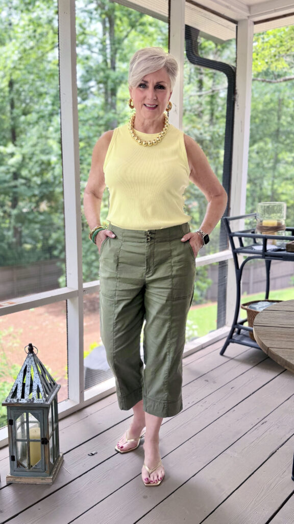
VERDICT: Buy if you keep every accessory neutral so the two colors can breathe. Skip the urge to add a third color — two is the whole charm.
Shop the look
Now the trick for making an outfit look expensive without any color at all.
4. Brown + Ivory
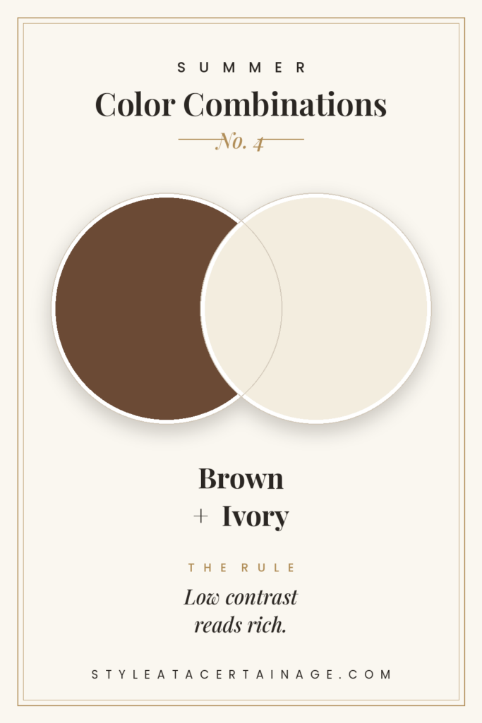
The rule: low contrast reads rich.
Here’s the one that surprises people. Grit & Glammers: looking expensive is often about less contrast, not more.
Picture a brown silk tank top with ivory-embroidered shorts, thin gold hoops, espresso leather sandals, and a raffia handbag.
Why it works: brown is a deep, toasted warm tone and ivory is a warm off-white, so the two come from the same family — a soft, low-contrast pairing, and that gentleness is exactly what reads rich instead of stark. Let the silk and the embroidery be the only details. Ivory’s the kinder choice here, too — it flatters more skin tones than a hard white. And if you loved brown as the color of the season last fall, this is how it translates to summer.
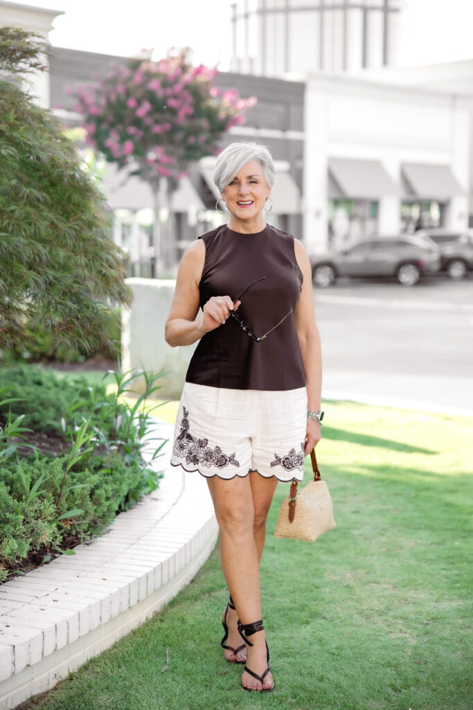
VERDICT: Buy — brown is the neutral of the year, and with ivory it’s warm and rich instead of heavy. The easiest “expensive” combination here.
Shop the look
- Similar Brown Silk Tank
- Embroidered Side Zip Shorts
- Espresso Leather Sandals
- Raffia Handbag
- Thin Gold Hoop Earrings
Speaking of neutrals — here’s the modern way to wear black in July.
5. Black + Khaki
The rule: contrast gives structure; keep your metals honest.
Black in summer isn’t off-limits — it just needs warmth beside it, and one consistent metal so nothing looks accidental.
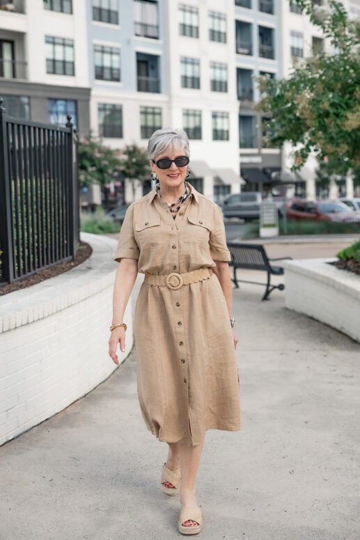
Picture a black tee with a khaki pleated skirt — or pull-on khaki pants, if you’d rather — black sandals, a leopard belt for a little wink, and minimal jewelry in a single tone.
Why it works: it’s all contrast and no color — the depth of black against the warmth of khaki gives the outfit structure and definition, while the khaki keeps the black from ever feeling severe. Let the khaki be the larger proportion and tuck the tee to define your waist. It’s the summer cousin of the combination I wrote about in why black and white is a chic color combination — same structure, warmer temperature.
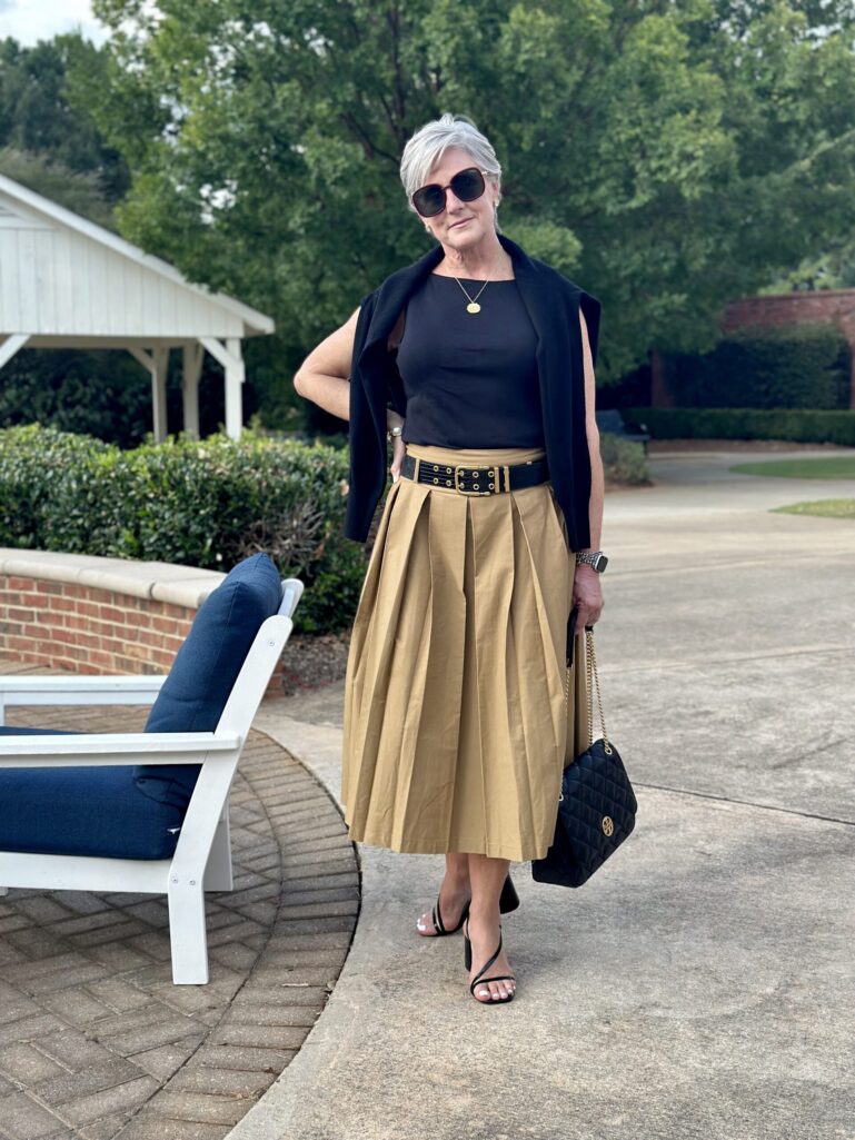

VERDICT: Buy — a relaxed, modern neutral that looks intentional with zero effort. Skip only if you want color; this one’s deliberately quiet.
Shop the look
And now, the most classic pairing in my closet — with a twist.
6. Blue + White
The rule: a classic palette earns you bold texture and pattern.
Blue and white is American Classic through and through — which is exactly why you can push it further than any other combination here.
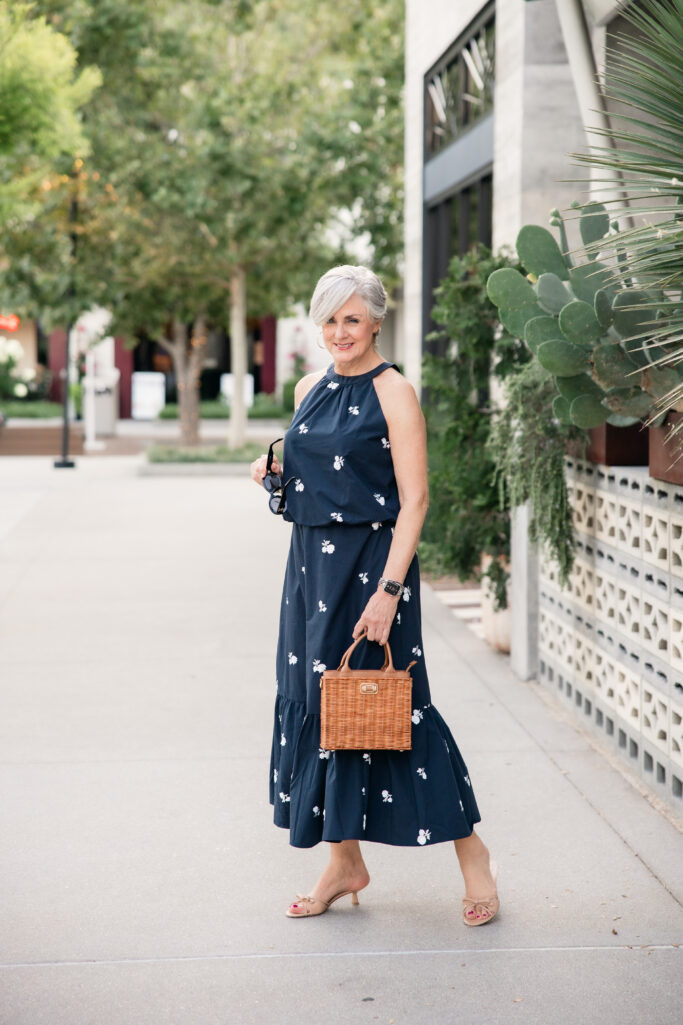
When the colors themselves are this timeless, the fabric gets to do something daring. Picture a blue sequin halter with the matching sequin maxi skirt, kitten heels, a wicker handbag, and thin gold hoops — evening-ready without a stitch of black. For daytime, the paisley sleeveless shirt with its matching wide-leg pants and raffia mules gives you the same blue-and-white story in a breezy, packable set.
Why it works: blue and white is the one combination your eye already trusts completely — think porcelain, seersucker, hydrangeas. Because the palette does the reassuring, the sequins and paisley read chic rather than loud. Finish with the Celine sunglasses and you’re done. And if a dress is more your speed, a navy halter maxi scattered with white embroidered blooms delivers the whole palette in one zip — wicker bag, kitten heels, out the door.
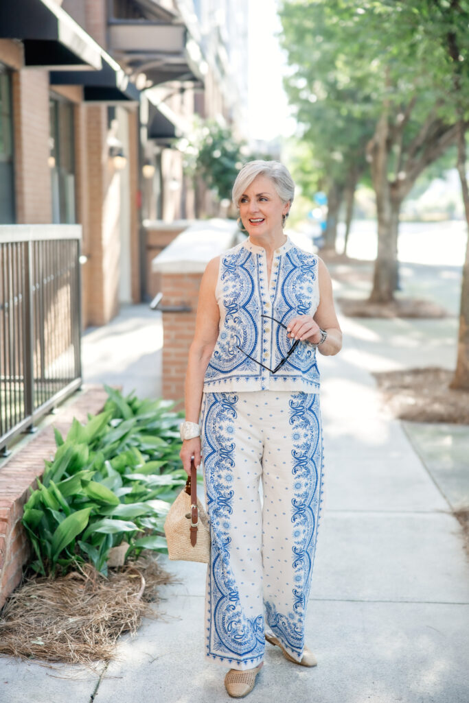
VERDICT: Buy — one classic palette, two completely different personalities. Skip the temptation to add color; blue and white wants to stand alone.
Shop the look
- Sequin Halter Top
- Sequin Maxi Skirt
- Kitten Heels
- Paisley Sleeveless Shirt
- Paisley Wide Leg Pant
- Raffia Mules
- Wicker Handbag
- Celine Sunglasses
- Thin Gold Hoop Earrings
And finally — the one I promised you. The pairing I wouldn’t have touched five years ago.
7. Lilac + White
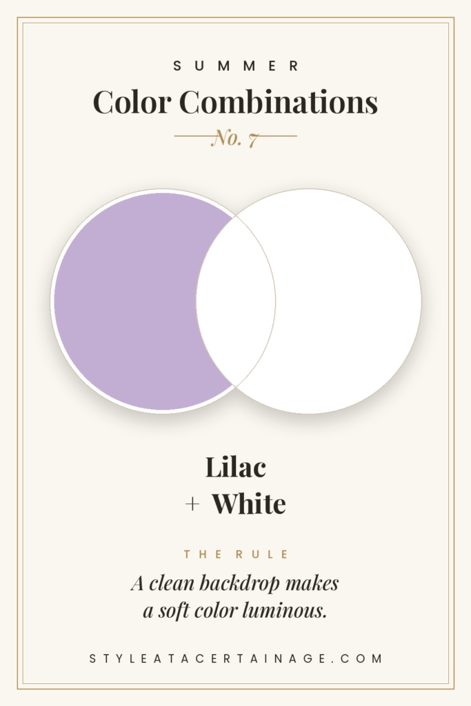
The rule: a clean neutral makes a soft color luminous.
The final rule is the prettiest: a soft color needs a clean backdrop to come alive, and nothing does that like white.
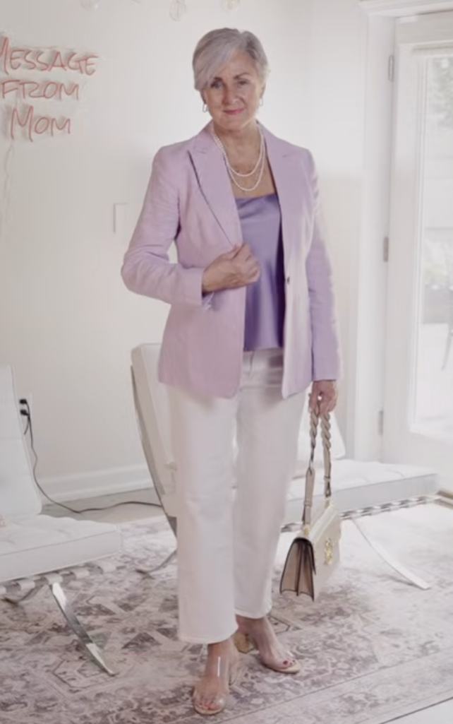
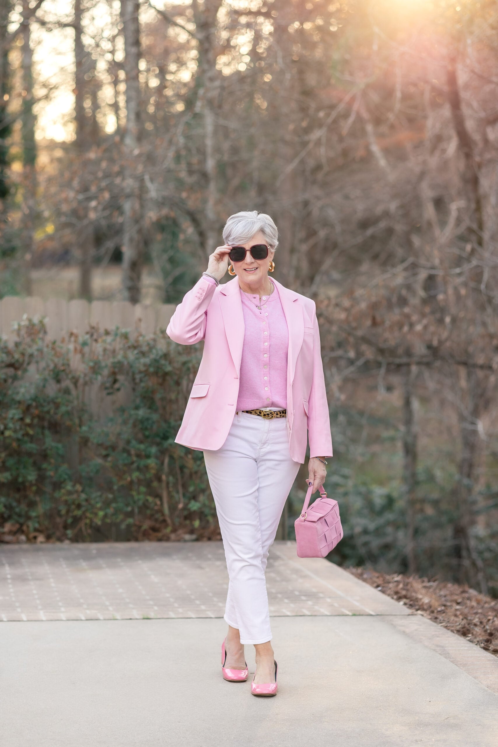
Picture a lilac linen blazer over a lilac camisole with white denim — or go head-to-toe tonal with the matching wide-leg pant, the way I styled it here — and a little silver at the ear.
Why it works: against crisp white, a cool lilac reads luminous and deliberate instead of dusty — and going tonal, lilac on lilac, actually reads more elevated than you’d expect. Reach for that smoky, grown-up lilac over a bright purple, and you’ve got a combination no one else in the room will be wearing.
VERDICT: Buy if you want something fresh that turns heads. Skip if you need a workhorse — this is a moment, not a uniform.
Shop the look
Told you that last one would surprise you.
Quick Styling Notes
Three fast rules that apply to every look above:
- The bag: when a combination is bold — your green and yellow, say — let the bag go neutral: tan, cognac, raffia, or wicker. It grounds the color and does the quiet work.
- The metal: match your metal to the undertone — gold with the brown-and-ivory and the warm reds, silver with the lilac. One metal per outfit, always.
- The sunglasses: a neutral tortoise or warm brown frame goes with every single look here. It’s the one accessory you never have to rethink.
Closing Thoughts
So that’s your summer of color — seven looks, seven rules, and zero reasons to keep hiding in beige.
Which combination are you trying first — and which one scares you a little? Drop it in the comments; I love hearing what you’re wearing.
Subscribe to the newsletter for weekly style, beauty, and lifestyle inspiration, and follow me on Instagram @styleatacertainage for daily outfit inspiration.
Until then, Grit & Glammers — style has no expiration date, and neither do you.
FAQ: Summer Color Combinations
The most flattering summer color combinations pair one clear color with a grounding neutral: butter yellow with light denim, brown with ivory, and lilac with white. For bolder moments, red with pink and green with yellow work beautifully when accessories stay neutral.
Yes. Pink is simply a lighter value of red, so the two read as one warm color family rather than a clash. The key is a true, clear red — not an orange-leaning one — and a small bridging detail like pink trim to tie them together.
Let one color lead and keep everything else quiet. Ground bold pairings with a neutral shoe and bag, stick to one metal for jewelry, and limit each outfit to two colors maximum. Restraint in the accessories is what makes boldness in the clothes look intentional.
Absolutely — black just needs warmth beside it. Pair a black tee with khaki, keep the khaki as the larger proportion, and choose one consistent jewelry metal. The result is structured and modern rather than heavy.






LEAVE A COMMENT